Design Systems · Accessibility · Enterprise SaaS · RPS

5,000+ components for a product I couldn't fully access

Project
Enterprise Design SystemProcurement SaaS (NDA)
Studio · Year
Rock Paper Scissors2023–2024
My role
Lead design system contributorClient-facing · Dev handoff
01 · The Challenge

The client needed a system. I couldn't see the product.

Procurement software for regulated financial institutions, white-labelled across enterprise clients.

Every new deployment triggered a manual rebuild. They needed one reusable design system. NDA meant I received screens without context. No flows, no journeys. Just fragments.

The existing state was inconsistent: different fonts, corner radii, and colours across every surface. No tokens. No documentation.
Why atoms-first wasn't optional
When you don't know what the full product looks like, you can't design top-down. You build the smallest pieces so anything new can be assembled from what exists.
02 · The Approach

Atoms → Molecules → Compounds

Buttons
Inputs
Checkboxes
Toggles
Dropdowns
Tables
Accordions
Tabs
Started with atoms because I couldn't predict what screens would arrive next. When requirements changed, I traced the change to the affected atom and rebuilt outward.

One form change could mean updating buttons, radios, checkboxes, toggles, tabs, accordions, and icons at once.

Every component built across 4 breakpoints with documented states: default, hover, focus, error, disabled. All token-based.
A deliberate decision
WCAG AA, not AAA
AAA is rarely achievable in enterprise products without compromising usability. We targeted AA. Every contrast ratio, focus state, and error message meets the standard. Inputs have labels. Errors have reasons. Colour is never the only indicator.
Component Library

Sample from the component library
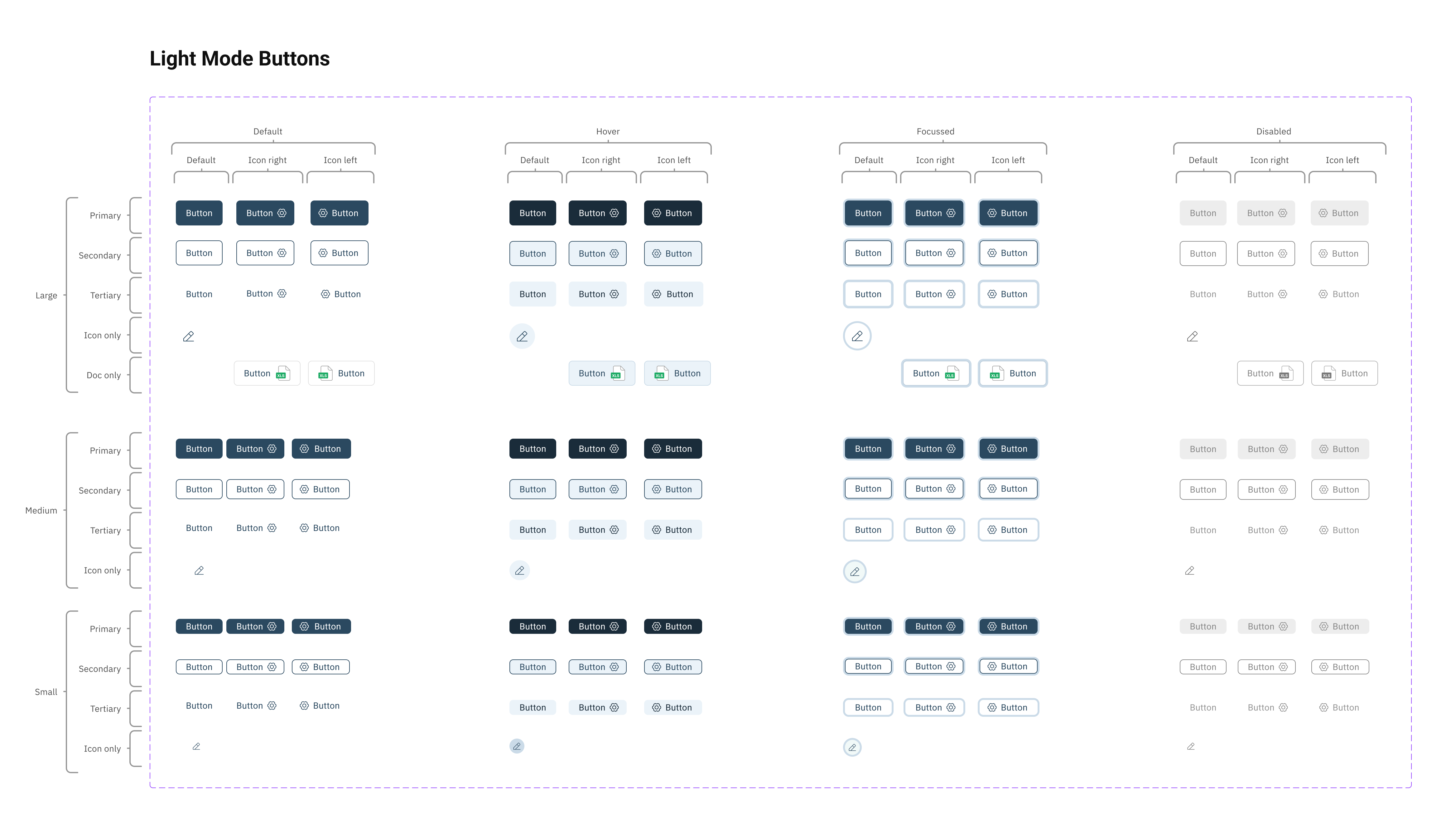
Button component matrix showing Primary, Secondary, Tertiary, and Icon-only variants across Large, Medium, and Small sizes, each in Default, Hover, Focused, and Disabled states with icon-left and icon-right options
01Buttons · 3 sizes × 5 types × 4 states × 3 icon positions
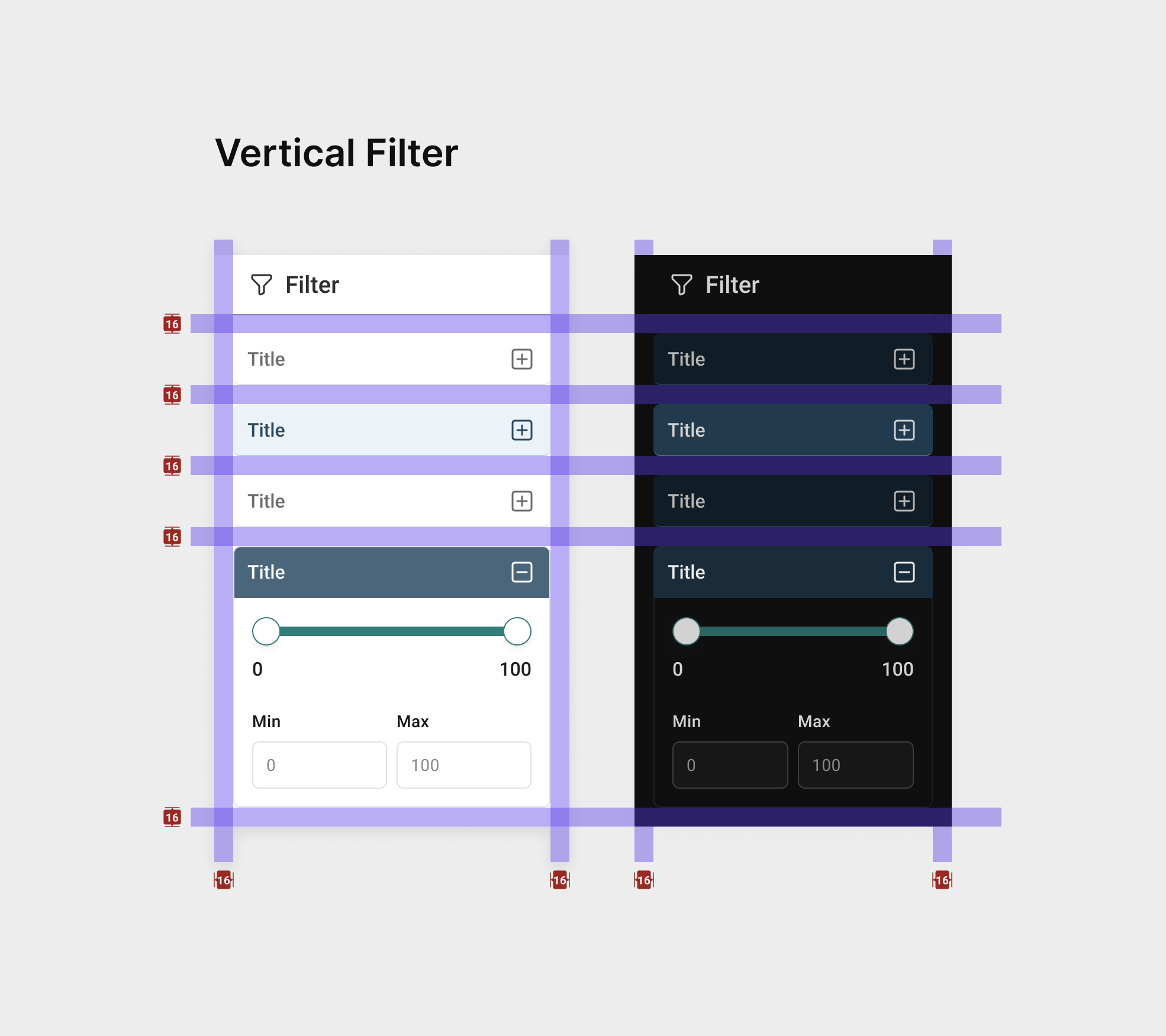
Filter panel components showing collapsed and expanded states, light and dark mode variants, with range sliders, dropdowns, search, and date pickers overlaid with spacing grid
02Filters · Light + Dark · Token-based spacing
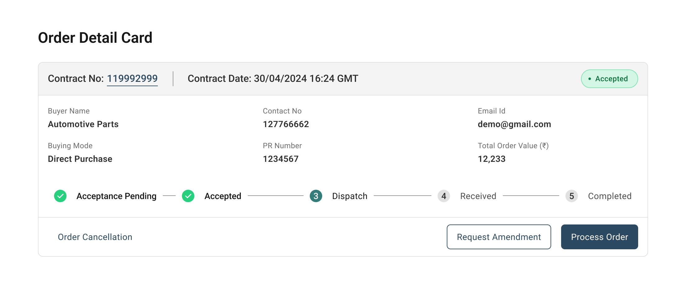
Order detail page showing buyer and seller information cards, contract details with status badges, and a multi-step progress tracker demonstrating components composed into a real product screen
03Composed screen · Atoms in a real product view
Scroll
03 · What Made It Hard

What made this hard

01
No context for incoming screens
Screens arrived without flow context. Atoms-first was the only way to avoid constant rework.
02
Changes cascaded everywhere
One compound change cascaded back to atoms. A new form state could mean updating 8 component types at once. Tokens kept this manageable.
03
Became the primary client contact
When the client–studio relationship got strained, I became the person they trusted most for calls and decisions. Forced thinking beyond happy paths.
04
Handoff meant teaching
Walkthroughs for designers and developers. Documented usage patterns and composition rules. The system had to work without me.
Scroll
04 · Outcomes

What shipped

5K+
Components
Buttons, inputs, tables, forms, modals, data displays. Every state, variant, and breakpoint. Token-based.
AA
WCAG 2.1
Correct contrast, visible focus states, labelled inputs, error messages with reasons. Built to standard.
0
Design back-and-forth post-handoff
Reusable components + documented tokens meant engineering could implement without asking questions.
05 · Takeaway

What I'd do differently

I'd push harder for access to real user flows earlier. Atoms-first worked, but I was guessing at composition patterns that could have been validated faster with product context.

Becoming the primary client contact when things got tense taught me more about stakeholder management than any design decision here. The system shipped and got adopted. That's the metric that matters.

More workAll work
01
AI · 0 to 1
CTV AI Campaign Platform
Affle 3i · 2025
Conversational AI platform for CTV advertising. Users describe their campaign, the AI handles everything else.
03
AdTech · Rule Builder
Feed Manager
Affle 3i · 2025
Boolean rule builder redesigned from a developer tool into a plain-language decision interface for non-technical users.
Now playing
0:000:00